The Delivery Dashboard: Work in Flight, and Work That Has Stopped
This is the fourth of the five GitHub dashboards and the one I use most. Where Release answers what is about to ship and Sprint answers how the fortnight is going, Delivery answers the software delivery lifecycle question: who has what, what has stopped moving, are we working on the right things, and is the review-and-build loop healthy.
Twenty-three panels in six rows. It also produced the single most uncomfortable finding in this whole project, which I will get to.
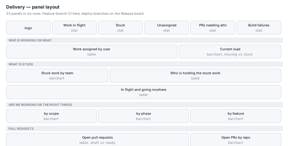
All names are anonymised. The numbers are real.
Defining work in flight
Everything on the top half of this board hangs off one definition, and it lives in the saved function rather than in any panel:
| extend IsWip = Status in ("In progress", "Ready for Review")
Ready for Testing is deliberately not work in flight. That work is built. The developer is done and the ball is with QA. Counting it as somebody’s load would mean the person who ships the most looks the most overloaded, which is exactly backwards and would make the whole board actively harmful.
Two more definitions in the same place:
| extend IdleDays = datetime_diff('day', now(), UpdatedAt)
| extend IsStuck  = IsWip and IdleDays >= 14
| extend Owner    = iff(isempty(Assignees), "(unassigned)", Assignees)
| extend IsUnassigned = isempty(Assignees) and Status != "Todo"
IsUnassigned excludes Todo on purpose. A backlog item with no assignee is normal; an item that is moving with nobody’s name on it is not.
The honest caveat on staleness
IdleDays is measured on the issue’s updatedAt, and that is the best signal available rather than the right one. It tells you how long an item has been quiet. It does not tell you how long it has been sitting in its current column, because the project board does not expose when an item entered a status.
Which means an item moved to In Progress three weeks ago and commented on yesterday reads as fresh.
The proper fix is already collecting. GitHubRoadmapHistory snapshots every item every day, so first-seen and last-seen per (item, status) gives real dwell time once there is enough history. On the day I built this there were two snapshots, so the numbers would have been meaningless. It is on the panel description as a known limitation, and it will get better on its own.
The headline strip
GitHubRoadmapLatest | where IsWip | summarize Value = count()
GitHubRoadmapLatest | where IsStuck | summarize Value = count()
GitHubRoadmapLatest | where IsWip and IsUnassigned | summarize Value = count()
GitHubPullRequestsLatest | where NeedsAttention | summarize Value = count()
GitHubWorkflowRunsLatest | where Branch !in ("develop", "main") | where IsFailed | summarize Value = count()
Work in flight, stuck, unassigned in flight, PRs needing attention, build failures.
Note the last one is the mirror image of the Release board’s filter: !in ("develop", "main"). Feature branches here, deploy branches there. Same table, two audiences, and neither board drowns the other in noise.
Work assigned by user
GitHubRoadmapLatest
| summarize Todo = countif(Status == "Todo"),
            ['In progress']    = countif(Status == "In progress"),
            ['In review']      = countif(Status == "Ready for Review"),
            ['Ready for test'] = countif(Status == "Ready for Testing"),
            Done = countif(IsDone),
            WIP = countif(IsWip),
            Stuck = countif(IsStuck),
            MVP = countif(Scope == "MVP"),
            ['Oldest idle (d)'] = maxif(IdleDays, IsWip),
            Total = count()
        by Developer = Owner
| order by WIP desc, Total desc
Every item on the board, by the person it is assigned to.
Ready for Testing gets its own column and is excluded from WIP, which is the definition above made visible. Somebody with fourteen items in Ready for Testing and two in progress has a WIP of two, and the fourteen are shown so nobody thinks they have been lost.
maxif(IdleDays, IsWip) is the oldest thing they are sitting on. Conditional aggregation rather than a filter, so the row still exists for people with no WIP at all.
Done is lifetime rather than this sprint, and the panel says so. Reading it as throughput would be wrong, because somebody who joined last month cannot catch up on a year of history.
Current load
GitHubRoadmapLatest
| where IsWip
| summarize Moving = countif(not(IsStuck)), Stuck = countif(IsStuck) by Developer = Owner
| order by (Moving + Stuck) asc
A stacked bar per person, green for moving and red for stuck.
The stack is the point. A tall bar that is mostly moving is a busy person. A tall bar that is mostly stuck is a blocked one. A plain count of assigned work makes those identical, and they need opposite responses.
Stuck work by team
GitHubRoadmapLatest
| where IsWip
| summarize Moving = countif(not(IsStuck)), Stuck = countif(IsStuck)
        by Team = iff(isempty(Team), "(unset)", Team)
| order by Stuck asc
Same stacking, grouped by the board’s Team field.
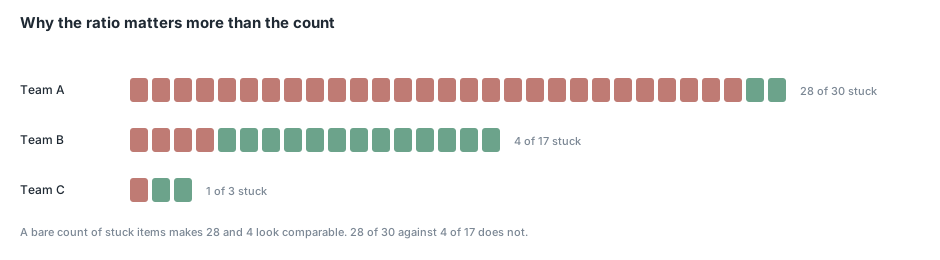
This is the panel that produced the finding I mentioned. One group had almost everything in flight sitting untouched, with a median idle time measured in months. Another, with a comparable amount of work in flight, had a median measured in days.
I want to be careful about what that does and does not mean, because a ratio like that is easy to wield badly. It is measured on updatedAt, so it partly reflects how much a group comments on issues, and different kinds of work have different natural cycles. What it does say, unambiguously, is that a large body of work had been picked up and not touched in a long time, and nobody had a number for that before.
The reason the panel stacks moving against stuck rather than charting stuck alone is exactly this. Two bare counts look comparable. Nearly-all-of-thirty against a handful-of-seventeen does not.
Who is holding the stuck work
GitHubRoadmapLatest
| where IsStuck
| summarize Stuck = count(), ['Oldest idle (d)'] = max(IdleDays),
            ['Median idle (d)'] = percentile(IdleDays, 50),
            MVP = countif(Scope == "MVP")
        by Team = iff(isempty(Team), "(unset)", Team), Holder = Owner
| order by Stuck desc
Team, then the person, then how long the oldest piece has sat.
Two deliberate choices. An item assigned to two people is listed under both names together, as one row, because that is how the board records it and splitting it would double count the work. And (unassigned) is a holder in its own right rather than a blank cell, because in-flight work with nobody’s name on it is the hardest kind to chase and hiding it in a gap is how it stays that way.
MVP on the end tells you whether the stuck work matters for the date everybody is asking about.
In flight and going nowhere
GitHubRoadmapLatest
| where IsStuck
| order by IdleDays desc
| project ['#'] = Number, Title, Developer = Owner, Status,
          ['Idle (d)'] = IdleDays, Scope, Phase, Iteration, Url
The item-level list behind the two panels above. Title links to the issue; the URL column is hidden.
Iteration is on here for a reason that took a moment to notice: a stuck item still carrying a sprint label from two months ago is a different kind of stuck from one with no sprint at all. The first was committed to and missed; the second was never scheduled.
Are we working on the right things
Three bar charts across one row, all over in-flight work.
GitHubRoadmapLatest
| where IsWip
| summarize Items = count() by Bucket = case(
    Scope == "MVP", "MVP scope",
    isnotempty(Phase), strcat("out of scope — ", Phase),
    "out of scope — unphased")
| order by Items asc
GitHubRoadmapLatest
| where IsWip
| summarize Items = count() by Phase = iff(isempty(Phase), "(no phase)", Phase)
| order by Phase asc
GitHubRoadmapLatest
| where IsWip
| summarize Items = count() by Feature = iff(isempty(Feature), "(unset)", Feature)
| order by Items asc
By scope, by phase, by feature area.
The first one is the one that matters and its wording is careful. Out-of-scope work is labelled “out of scope”, not “wrong”. It is real work that somebody needs done; it is just not what the MVP date depends on. A chart that implies otherwise gets argued with instead of acted on.
The (no phase) and (unset) buckets are explicit rather than filtered out. If most of the in-flight work has no phase and no feature area, that is a labelling problem worth seeing, and quietly dropping those rows would hide it. On our board a large share of items carry no feature label at all, which is itself the finding.
Open pull requests
GitHubPullRequestsLatest
| extend Why = case(HasNoReviewer and IsStale, "no reviewer, and idle",
                    HasNoReviewer, "nobody asked to review",
                    IsStale, "idle",
                    IsDraft, "draft",
                    "in review")
| order by IsDraft asc, AgeDays desc
| project Repo = Repository, ['#'] = Number, Title, Author,
          Kind = iff(IsDraft, "draft", "ready"),
          ['Age (d)'] = AgeDays, ['Idle (d)'] = IdleDays,
          Reviewers = ReviewerCount, Why, Url
Drafts and review-ready PRs are held to different clocks, which is the whole design of this panel. A draft open seventy-seven days is somebody’s parked branch. A review-ready PR open seventy-seven days is a review nobody did. One combined “old PRs” number hides the second inside the first.
The sort is IsDraft asc first, so review-ready rises to the top regardless of age.
Why distinguishes “nobody asked to review” from “idle”, and that distinction has a different fix. When I first ran this, every review-ready pull request had zero requested reviewers. Nobody was slow. Nobody had been asked.
Age and idle are separate columns with separate thresholds: age amber at 14 and red at 30, idle at 7 and 21. A PR opened a month ago and updated yesterday is healthy; opened a week ago and untouched since is not.
Build and test health
GitHubWorkflowRunsLatest
| where Branch !in ("develop", "main")
| where IsFailed or IsInFlight
| extend When = coalesce(UpdatedAt, CreatedAt)
| order by When desc
| project Repo = Repository, Workflow = WorkflowName, Branch, Actor,
          Outcome = iff(IsInFlight, strcat("running ", tostring(WaitingMinutes), "m"), Conclusion),
          When, Url
The feature-branch half of the workflow data, with the same in-flight-minutes treatment as the Release board.
Branch gets a wide column here where it is narrow on the Release board, because feature branch names are long and they are the most useful column on this panel. One branch failing repeatedly dominates the failure count, and the panel description says to check the branch column before concluding a repository is broken. That is not hypothetical: five of our ten failures in one window were the same smoke test on a single agent branch.
Conclusion
The design principle running through this board is that a count on its own is almost never enough. Stuck work needs the in-flight total beside it or you cannot tell 28-of-30 from 4-of-17. A person’s load needs splitting into moving and stuck or you cannot tell busy from blocked. An old pull request needs to know whether it is a draft. An old issue needs to know whether it was ever assigned.
Every one of those is one extra countif in a summarize, and each one turns a number that starts an argument into a number that starts a conversation. The uncomfortable finding on this board was not that one team had twenty-eight stuck items. It was that the ratio made it undeniable, and the ratio cost nothing to add. The final article covers the MVP and Developers boards.