The MVP and Developer Dashboards, and What I Would Do Differently
This is the last article in the series. Two dashboards left: MVP, which answers “are we done yet”, and Developers, which answers “what is everybody producing”. Then I want to close with what I would do differently, because after twenty articles it would be strange to pretend it all went smoothly.
Names anonymised throughout, numbers real.
MVP: the question everybody actually asks
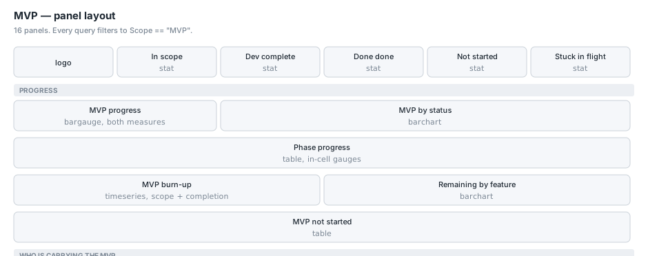
Sixteen panels, and every query starts the same way:
GitHubRoadmapLatest
| where Scope == "MVP"
Scope is set by the collector from an issue label, and stored as the string "MVP" rather than the label text, because the label is configuration and the meaning is not.
The two percentages
GitHubRoadmapLatest | where Scope == "MVP"
| summarize Value = round(100.0 * countif(IsComplete) / count(), 1)
GitHubRoadmapLatest | where Scope == "MVP"
| summarize Value = round(100.0 * countif(IsDone) / count(), 1)
Dev complete and done done, and the board shows both, side by side, always.
When I built it the two measures were about twenty points apart. That gap is the difference between “Ready for Testing or Done” and “Done”, and it is not a rounding difference. Quoting either one alone tells a materially different story about the same body of work, and whichever you pick, somebody will reasonably feel misrepresented.
There is a bargauge panel that renders both as gradient bars for exactly this reason:
GitHubRoadmapLatest | where Scope == "MVP"
| summarize ['Dev complete'] = round(100.0 * countif(IsComplete) / count(), 1),
            ['Done done']    = round(100.0 * countif(IsDone) / count(), 1)
Putting them adjacent is a small design decision that removed a recurring argument.
Phase progress
GitHubRoadmapLatest
| where isnotempty(Phase)
| summarize Items = count(),
            Todo = countif(Status == "Todo"),
            ['In progress']    = countif(Status == "In progress"),
            ['In review']      = countif(Status == "Ready for Review"),
            ['Ready for test'] = countif(Status == "Ready for Testing"),
            Done = countif(Status == "Done"),
            ['Dev complete %'] = round(100.0 * countif(IsComplete) / count(), 1),
            ['Done done %']    = round(100.0 * countif(IsDone) / count(), 1)
        by Phase
| order by Phase asc
The two percentage columns render as in-cell gauges through a field override, so you read the table as a set of progress bars rather than as numbers:
{
  "id": "custom.cellOptions",
  "value": { "type": "gauge", "mode": "gradient", "valueDisplayMode": "text" }
}
The panel description carries a caveat that matters: phases come from labels, an item can carry more than one, and the collector resolves to the first match in an ordered list. So the buckets are exclusive even though the labels are not. One item on our board carries two phase labels, which is why that rule is real rather than theoretical.
MVP burn-up
GitHubRoadmapHistory
| where Scope == "MVP"
| summarize ['In scope'] = count(),
            ['Dev complete'] = countif(IsComplete),
            ['Done done'] = countif(IsDone)
        by SnapshotDate
| order by SnapshotDate asc
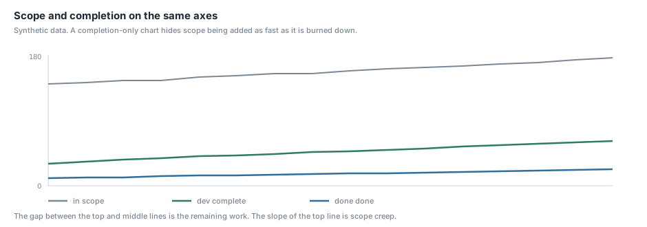
A burn-up rather than a burn-down, and the difference is the point. It plots scope alongside completion.
A chart that shows only completion rising looks like progress even when scope is being added just as fast. Plotting both means the gap between the lines is the remaining work, and the shape of the top line is scope creep made visible. That is the failure this chart exists to catch, and a completion-only chart is actively reassuring while it happens.
Same limitation as the sprint burn-down: it is only as long as your collection history, because GitHub keeps none of its own.
MVP not started
GitHubRoadmapLatest
| where Scope == "MVP"
| where Status == "Todo"
| summarize Items = count()
        by Feature = iff(isempty(Feature), "(unset)", Feature),
           Phase = iff(isempty(Phase), "(none)", Phase)
| order by Items desc
This is the number that has to reach zero, and grouping it by feature and phase tells you where the remaining work is concentrated rather than just how much of it there is.
Developers: throughput, carefully
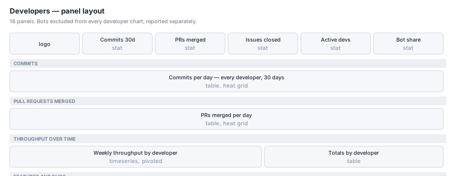
Sixteen panels, and the design constraints here are ethical as much as technical.
The heat maps
Two grids, one for commits and one for merged pull requests, thirty days across, one row per person. Same structure as the sales activity grid from earlier in the series: date-first column labels because evaluate pivot() sorts alphabetically, weekday letters with R for Thursday, cross-joined and zero-filled so a quiet day is black rather than absent.
let people = GitHubDevActivityLatest
  | where not(IsBot) and Day >= start and ActivityType == "Commit"
  | distinct Actor;
let days = range Day from start to today step 1d
| extend DW = case(dayofweek(Day) == 0d, "S", dayofweek(Day) == 1d, "M", ...)
| extend Label = strcat(format_datetime(Day, "MM-dd"), " ", DW);
days
| extend k = 1
| join kind=inner (people | extend k = 1) on k
| project Day, Label, Actor
| join kind=leftouter (
    GitHubDevActivityLatest
    | where not(IsBot) and Day >= start and ActivityType == "Commit"
    | summarize C = count() by Day, Actor
  ) on Day, Actor
| extend C = coalesce(C, 0)
| project Developer = Actor, Label, C
| evaluate pivot(Label, sum(C), Developer)
not(IsBot) on every panel. The bot list is configuration and includes two coding agents that commit under plain names with no [bot] suffix.
Weekly throughput
GitHubDevActivityLatest
| where not(IsBot)
| where ActivityType in ("PullRequestMerged", "IssueClosed")
| where WeekStart >= startofweek(datetime_utc_to_local(now(), "America/New_York") - 1d) + 1d - 77d
| summarize Throughput = count() by WeekStart, Actor
| evaluate pivot(Actor, sum(Throughput), WeekStart)
| order by WeekStart asc
Merges and closures only, not commits. This is the chart people will compare themselves against, and commit counts are not comparable between people: somebody who squashes has one commit where somebody who merges a branch has fourteen, for the same work. Our data had one person with a couple of orders of magnitude more commits than another over the same ten days, and the second of them had merged more pull requests than the first.
The commits heat map stays, because the rhythm is genuinely useful — you can see when somebody was heads-down and when they were not — but nothing comparative is built on it.
The pivot is the fix for the bug I shipped twice. In long format Grafana names the series after the numeric column, so the chart rendered as a single line called “Throughput” with no names on it at all.
Features and bugs
GitHubDevActivityLatest
| where ActivityType == "IssueClosed" and not(IsBot)
| where Day >= startofday(now()) - 29d
| summarize Features = countif(IsFeature), Bugs = countif(IsBug) by Day
| order by Day asc
IsFeature and IsBug test the label array rather than the joined string, because bug is a substring of debug.
The panel description is doing important work here: only about forty-five closed issues in the window carry either label, so the lines are a floor rather than the whole story. Without that note somebody would read a flat week as “nothing shipped” when it means “nothing was labelled”.
What I would do differently
Reconcile against a human before you ship
The best decision in the whole project was checking my HubSpot weekly numbers against six weeks of a hand-built report. My first version matched zero of six weeks and looked completely plausible. Activity counts have no external reference, so a wrong one is indistinguishable from a right one.
If you are automating something a person currently does by hand, diff against their output before you replace them, and treat any mismatch as a bug in your understanding.
Start collecting before you need the chart
Two of the most useful panels — the MVP burn-up and the sprint burn-down — are only as long as the collection history, because GitHub keeps no board history and you cannot backfill it. The snapshot cost is trivial. The history is unrecoverable.
I would now start snapshotting anything stateful on day one, even with no dashboard in mind.
Test every panel query before committing
I got into the habit of extracting every query from the dashboard JSON and running it against the workspace before committing. It caught a summarize with no aggregate function that Log Analytics rejects outright, on a tile that would have shipped visibly broken. Fifty-six queries, one failure, about ninety seconds.
Watch for silence, not errors
Nearly everything that went wrong in this project was quiet. A DCR schema change that drops new columns while reporting success. A summarize that omits the service with no pods. A saved function with a leading let that saves cleanly and fails only when called. A partial subscription read that produces a cost total which is simply too small. A long-format time series that merges three people into one unnamed line.
None of those throw. All of them produce a dashboard that looks fine.
The habit that helps is asking, for each panel, “what would this look like if the underlying thing were broken” — and if the answer is “the same, or emptier”, add a seed row, a warning line, or a count you can reconcile against something external.
Two things I could not deliver
Worth being straight about. Two of the asks in this project could not be built, and neither was a technical problem.
“Which offerings are leads most interested in” needs a field the CRM does not have. “Show me the quarter milestone” needs fields that exist on the board and that nobody has filled in. In both cases I collect the fields anyway, so they work the day somebody starts populating them, and in both cases the honest answer was that the dashboard cannot invent data the source system does not hold.
That is a more common outcome than most write-ups admit. A good part of building an analytics layer is discovering which of your questions your systems are not yet capturing the answer to.
Conclusion
Twenty articles, four collectors, seven dashboards, and the whole thing runs on a Log Analytics workspace we were already paying for, with cron jobs that scale to zero.
The architecture never got more complicated than the diagram in the first article, and I think that is the main result. There was no point at which a real data warehouse would have made this easier. What there was, repeatedly, was a point where an API returned something subtly different from what I assumed, and the cost of that assumption was a chart that looked right.
A closing thought on why I ended up doing this at all.
The first time I built dashboards like these it was at Microsoft, for engineers, about infrastructure. The second time was a talk about the Terraform provider that makes them reproducible. This time the audience is a startup where the same handful of people are responsible for the pipeline being green, the MVP landing, the leads being followed up and the bill being survivable. There is no separate BI team to hand the commercial questions to, and there is no separate ops team to hand the technical ones to.
That is the actual argument for putting all of it in one workspace behind one query language. Not cost, though it is cheaper. It is that when the person asking “are we going to make the date” is the same person who asks “why did that deploy fail”, making them use two products with two logins and two mental models is a tax on the thing you most want them doing, which is noticing that the answers are related.
If you build something similar, the piece I would most encourage you to copy is the saved function boundary. Not because deduplication is hard, but because having one obvious place to put a definition means that a year from now, when somebody adds the fortieth panel, they will inherit your decisions instead of inventing their own. That is the difference between a dashboard that ages well and one that quietly stops meaning anything.