The Sprint Dashboard, and Building a Burn-Down From Snapshots
The Release board answers what is about to ship. This one answers how the current iteration is going, and it is the smallest of the five dashboards at twelve panels.
It is also the one that could not have been built without the daily snapshots, and the one where a chart everybody has seen a thousand times turned out to need more thought than I expected.
The sprint defines itself
The first problem is knowing which sprint is current, and I did not want the answer to be a hardcoded name that somebody has to change every fortnight. That kind of maintenance does not get done, and the failure mode is a board that silently shows the previous sprint.
The iteration field value carries startDate and duration, which the collector stores per item as IterationStart and IterationEnd. So “current” is a comparison:
| extend IsCurrentSprint = isnotnull(IterationStart)
                           and IterationStart <= now() and now() < IterationEnd
That rolls over on its own at the sprint boundary. The end is exclusive, so a fourteen day sprint starting on the fifth runs through the eighteenth and the nineteenth belongs to the next one.
The sprint name tile then reads out of the data rather than from configuration:
GitHubRoadmapLatest
| where IsCurrentSprint
| distinct Iteration
| take 1
| project Value = Iteration
Small confession about that query. My first version was:
| summarize Value = 0 by Iteration | project Value = Iteration | take 1
which is not valid KQL, because summarize needs at least one aggregate function. Log Analytics rejects it outright with a semantic error, so the panel was never going to render. I only caught it because I got into the habit of running every panel query against the workspace before committing, and it was the one failure out of fifty-six. Without that pass it would have shipped as a broken tile on a board people were about to start using.
The headline strip
GitHubRoadmapLatest | where IsCurrentSprint | summarize Value = count()
GitHubRoadmapLatest | where IsCurrentSprint | where IsDone | summarize Value = count()
GitHubRoadmapLatest | where IsCurrentSprint
| summarize Value = round(100.0 * countif(IsComplete) / count(), 1)
GitHubRoadmapLatest | where IsCurrentSprint
| summarize Value = max(datetime_diff('day', IterationEnd, now()))
Committed, done, percent complete, days left.
Days left is derived from the iteration window rather than counted from a config value, which is the same principle as the sprint name. It goes red as it approaches zero rather than green, because at the end of a sprint a small number is a warning rather than an achievement.
Note the split between IsDone and IsComplete, which runs through this whole series. IsDone is status Done. IsComplete is Ready for Testing or Done. On our board those differ by a lot, and the tiles report both because the team’s own language has two words for it.
The burn-down
Here is the panel this article is really about.
A burn-down needs three things: how much work remains on each day of the sprint, how much was committed, and where a steady burn would have you. The first is the interesting one, because GitHub has no idea what your board looked like yesterday. There is no history endpoint and no event stream carrying the previous value.
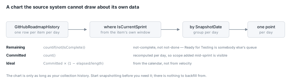
That is what the daily snapshots are for. GitHubRoadmapHistory gives one row per item per day, and the burn-down is a group-by over it:
GitHubRoadmapHistory
| where isnotnull(IterationStart) and IterationStart <= now() and now() < IterationEnd
| summarize Remaining = countif(not(IsComplete)), Committed = count(),
            Start = min(IterationStart), End = min(IterationEnd)
        by SnapshotDate
| extend Elapsed = datetime_diff('day', SnapshotDate, Start)
| extend Length  = datetime_diff('day', End, Start)
| extend Ideal   = round(Committed * (1.0 - todouble(Elapsed) / todouble(Length)), 1)
| order by SnapshotDate asc
| project SnapshotDate, Remaining, Ideal
Several decisions in there are worth explaining.
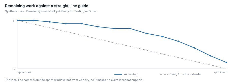
Remaining is “not complete” rather than “not done”. An item sitting in Ready for Testing has been built; the developer’s work on it is finished and it is waiting on QA. Counting it as remaining makes the line refuse to come down through the second half of every sprint and blames engineering for a queue somewhere else. If you want a QA burn-down that is a separate and legitimate chart, and it should be its own panel rather than distorting this one.
Committed is recomputed per day rather than fixed. Committed = count() inside the group means the scope line reflects what was in the sprint on that day. Items added mid-sprint show up as the ideal line stepping upward, which is honest. Fixing the commitment at the sprint’s opening value would hide scope creep, which is the single most useful thing a burn-down can show you.
The ideal line comes from the calendar, not from velocity. Committed × (1 − elapsed/length). It is a straight line from the day’s commitment down to zero at the sprint end. That is a deliberately naive guide, because a velocity-derived line needs several completed sprints to mean anything and quietly encodes past performance as a target. The straight line makes no claim beyond “if you burned evenly, you would be here”.
It is styled as a dashed grey line through a field override, so it reads as a guide rather than as a second measurement:
{
  "matcher": { "id": "byName", "options": "Ideal" },
  "properties": [
    { "id": "color", "value": { "mode": "fixed", "fixedColor": "#8E8E9E" } },
    { "id": "custom.lineStyle", "value": { "fill": "dash", "dash": [10, 10] } },
    { "id": "custom.lineWidth", "value": 1 }
  ]
}
spanNulls is false. A missing day should be a gap in the line, not a straight segment drawn across it. If the collector fails for a day I want that visible on the chart rather than smoothed over.
The honest limitation
This chart is only as long as your collection history. GitHub keeps no board history, so there is nothing to backfill from, and on the day I built it the burn-down was a single point.
I put that in the panel description rather than hiding it, because a chart with one dot on it looks broken and it was not:
One point per day, starting the day collection began — GitHub keeps no board history, so there is nothing earlier to backfill and the line will be short until a few days accumulate.
If you build this, the corollary is: start collecting before you need the chart. The snapshot cost is trivial and the history is unrecoverable.
The sprint board table
GitHubRoadmapLatest
| where IsCurrentSprint
| summarize Items = count(), Stuck = countif(IsStuck) by Status, StatusOrder
| order by StatusOrder asc
| project Status, Items, Stuck
Where the sprint’s work actually sits, in board column order. StatusOrder comes from the collector, driven by a Terraform variable listing the columns in workflow order, so this sorts correctly without knowing what the columns are.
The Stuck column beside each status is the useful part. Twelve items in In Progress is fine; twelve items in In Progress of which nine are stuck is a standup topic.
Not finished
GitHubRoadmapLatest
| where IsCurrentSprint
| where not(IsComplete)
| order by StatusOrder desc, IdleDays desc
| project ['#'] = Number, Title, Developer = Owner, Status,
          ['Idle (d)'] = IdleDays, Scope, Phase, Url
Everything in the sprint that is not Ready for Testing or Done, most-advanced first.
The sort is deliberate: StatusOrder desc puts the nearly-finished work at the top. In the last few days of a sprint the useful question is “what is closest to done that we could finish”, not “what has been sitting longest”. Within a status, the stalest sorts first.
Title links through to the issue, with the URL column hidden by an override.
Sprint load by developer
GitHubRoadmapLatest
| where IsCurrentSprint
| where not(IsComplete)
| summarize Remaining = count() by Developer = Owner
| order by Remaining asc
Who still has sprint work outstanding. Deliberately outstanding work rather than all assigned work, because at day nine of a fortnight the question is who needs help, not who was allocated what.
Owner comes from the saved function, which maps an empty assignee list to (unassigned) rather than dropping the row. Unassigned work in the current sprint is exactly the kind of thing that goes missing, and a blank cell hides it.
What the data looked like
Two things worth recording from the first real run, both of which look like bugs and are not.
The current iteration had six items, where the previous one had 209. That is because it had started the previous day. A near-empty sprint board at the start of a sprint is correct, and I mention it because my first reaction was that the filter was broken.
And the burn-down was a single dot, for the reason above.
Both of those are the kind of thing that erodes confidence in a new dashboard on the day you show it to people. Being able to say “this is right, and here is why it looks like that” in the panel description saved the conversation.
Conclusion
Most of this board is a filter over a saved function, and the one genuinely interesting panel is the burn-down. The three decisions in it that I would defend are: remaining means not-complete rather than not-done, so the chart measures the thing the team controls; commitment is recomputed daily so scope creep is visible rather than hidden; and the ideal line comes from the calendar rather than from velocity, so it makes no claim it cannot support.
The larger point is that none of it was possible without having decided, weeks earlier, to snapshot a board that no API will ever let you look back through. That is the cheapest decision in this whole series and the one with the longest lead time on its payoff. The next article is the Delivery board, which is where “who is holding work that has stopped” turned out to have a very uncomfortable answer.