The Sales Ops Dashboard, Part Two: Cracks and Follow-Through
The previous article covered the top half of our Sales Ops dashboard: the headline strip, the daily activity grid, and the pipeline funnel. This article is the bottom half, which is the part that turned out to be the reason anybody opens it.
Two rows. “Falling through the cracks” is four lists of things that have gone quiet. “Follow-through” is two panels about whether people finish what they start. Everything here leans on the definitions from the functions article, so the queries stay short.
Names are anonymised throughout. The numbers are real.
Deals needing attention
Full width, and the interesting column is the one that explains itself.
HubSpotDealsLatest
| where IsOpen and NeedsAttention
| extend Why = trim(@"\s+", strcat(
      iff(IsStuck,   strcat("stuck ", tostring(DaysInStage), "d  "), ""),
      iff(IsStale,   strcat("quiet ", tostring(DaysSinceActivity), "d  "), ""),
      iff(IsOverdue, "past close date  ", ""),
      iff(HasOwner == false, "no owner", "")))
| order by DaysInStage desc
| project Deal = DealName, Account = CompanyName, Stage, Owner = OwnerName,
          ['Days in stage'] = DaysInStage, ['Days quiet'] = DaysSinceActivity,
          ['Close date'] = CloseDate, Why, Amount
Why is built by concatenating whichever flags are set and trimming the result. A deal can be more than one thing at once, and the string tells you which, with the numbers inline: stuck 39d quiet 21d.
Both Days in stage and Days quiet are their own columns as well, coloured independently. Days in stage goes amber at 21 and red at 45; days quiet at 14 and 30. Those thresholds are different because the underlying events are different, which is the whole argument from the functions article rendered as two columns instead of one.
Sorting is by days in stage rather than days quiet. If I have to pick one to lead on, it is the one an activity report would hide.
Accounts gone quiet
HubSpotCompaniesLatest
| where NeedsAttention
| order by DaysSinceActivity desc
| project Account = Name, Owner = OwnerName, ['Days quiet'] = DaysSinceActivity,
          Deals = NumAssociatedDeals, Stage = LifecycleStage,
          ['Ever touched'] = HasActivity
One line of filter, because NeedsAttention on the company function already encodes the IsWorked split that took this list from 128 rows to 14.
I want to point at the panel description here rather than the query, because on this panel the description is doing real work:
Accounts someone actually started on — has a deal, or some logged history — that are now past the staleness threshold or have no owner. The 106 accounts with no owner, no deal and no activity ever are excluded: that is an import to triage, not a follow-up failure, and mixing them in buries the dozen that were being worked and went quiet.
Somebody will eventually ask why the board shows a dozen-odd accounts when the CRM holds many times that. Putting the answer on the panel means they find it before they ask, and it means the next person to edit the query knows the exclusion is deliberate.
Ever touched stays visible as a boolean column even though the filter guarantees most rows are true, because the handful of false ones are accounts with a deal and no logged activity at all, which is its own kind of odd.
Active leads going cold
HubSpotContactsLatest
| where IsActiveLead and NeedsAttention
| extend Why = case(EverContacted == false and HasOwner, 'assigned, never contacted',
                    EverContacted == false, 'never contacted, no owner',
                    HasOwner == false, 'contacted, then left unowned',
                    'worked, then went quiet')
| order by DaysSinceContact desc
| project Lead = FullName, Account = CompanyName, Owner = OwnerName,
          ['Days since contact'] = DaysSinceContact, Why, Status = LeadStatus
Same shape as the deals panel, and Why is doing the same job with more consequence.
The breakdown, when I first built it, was roughly five leads assigned to somebody and never contacted for every one that was contacted and then went quiet. Those two need completely different conversations, and a single “stale leads” number invites the wrong one.
Days since contact falls back to the created date when a lead has never been contacted, which is the coalesce from the functions article. Without it the never-contacted leads carry a null, sort to the bottom, and drop out of the list built to catch them.
Overdue tasks
HubSpotActivityLatest
| where IsOverdueTask
| extend ['Days overdue'] = datetime_diff('day', now(), ActivityDate)
| order by ['Days overdue'] desc
| project Owner = OwnerName, Account = CompanyName, Deal = DealName,
          Due = ActivityDate, ['Days overdue'], Status = TaskStatus
Tasks with a due date in the past that are not marked complete.
This panel exists because of one property in the collector. hs_task_status is only meaningful on tasks, and I nearly did not request it because asking for a task-specific property on six object types felt untidy. Without it a completed task and one rotting in the queue are identical rows, and this panel is not possible.
Thresholds are tight here, amber at 3 days and red at 14, because a task with a due date is a promise somebody made to themselves with a specific date on it.
Follow-up after a meeting or call
This is the panel that got the strongest reaction, and it is the most involved query on the board.
The question is: after every meeting and call, how long until the rep sent the next outbound thing to that account.
let touch = HubSpotActivityLatest
  | where ActivityType in ("Meeting", "Call") and isnotempty(CompanyId)
  | project TouchId = EngagementId, TouchType = ActivityType,
            TouchTime = coalesce(ActivityDate, CreatedDate),
            CompanyId, CompanyName, OwnerName;
let follow = HubSpotActivityLatest
  | where ActivityType in ("Email", "Note", "Message")
      and isnotempty(CompanyId) and IsOutbound
  | project CompanyId, FollowTime = CreatedDate;
touch
| join kind=leftouter (follow) on CompanyId
| extend Cand = iff(isnotnull(FollowTime) and FollowTime > TouchTime, FollowTime, datetime(null))
| summarize FirstFollow = min(Cand)
        by TouchId, TouchType, TouchTime, CompanyId, CompanyName, OwnerName
| extend ['Hours to follow-up'] = round(datetime_diff('minute', FirstFollow, TouchTime) / 60.0, 1)
| extend Outcome = case(isnull(FirstFollow), "NO FOLLOW-UP",
                        ['Hours to follow-up'] <= 24, "same day",
                        ['Hours to follow-up'] <= 72, "within 3 days",
                        "slow")
| order by TouchTime desc
| project When = TouchTime, Type = TouchType, Account = CompanyName, Owner = OwnerName,
          ['Hours to follow-up'], Outcome
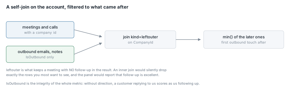
The shape is a self-join on company: every meeting joined to every outbound touch on the same account, filtered to touches that came after the meeting, then min() to take the earliest.
Three things worth calling out.
IsOutbound is the entire integrity of this metric. It comes from the email direction property, and without it a customer replying to us counts as us following up. The panel would then report that we are excellent at following up, and it would be measuring the opposite of what it claims. This is my favourite example in the whole project of a metric that is worse than useless when it is subtly wrong, because it produces confident false reassurance.
kind=leftouter and the null candidate. The left outer join keeps meetings that have no subsequent outbound touch at all, and the iff turns non-qualifying rows into nulls so min() skips them. A meeting with no follow-up survives to the output with a null and gets labelled NO FOLLOW-UP, which is the row you most want to see. An inner join would have silently dropped exactly those.
Notes count as follow-up. Email, note and message all qualify. A rep who logs a note saying “sent next steps” has followed up as far as this panel is concerned. That is generous, and deliberately so: the panel is about the discipline, not about policing the channel.
The outcome buckets are same day, within three days, slow, or none. When I first ran it over our data, nearly half the meetings had no outbound follow-up logged at all. Not a slow one. None.
Meeting cadence by account
HubSpotActivityLatest
| where ActivityType == "Meeting" and isnotempty(CompanyId)
| extend MTime = coalesce(ActivityDate, CreatedDate)
| summarize Meetings = count(), LastMeeting = max(MTime), FirstMeeting = min(MTime),
            Owner = any(OwnerName), Account = any(CompanyName)
        by CompanyId
| extend ['Days since last'] = datetime_diff('day', now(), LastMeeting)
| extend ['Avg days between'] = iff(Meetings > 1,
      round(datetime_diff('day', LastMeeting, FirstMeeting) * 1.0 / (Meetings - 1), 1), real(null))
| order by ['Days since last'] desc
| project Account, Owner, Meetings, ['Days since last'], ['Avg days between'], LastMeeting
Two different numbers that are easy to confuse and both matter.
Avg days between is the cadence the account is actually running at: span divided by gaps, which is Meetings - 1 and not Meetings. Getting that denominator wrong is an easy off-by-one that flatters every account.
Days since last is the open gap right now. An account with a fourteen-day cadence and forty days since the last meeting is a different situation from one with a forty-day cadence sitting at forty days.
The iff(Meetings > 1, ..., real(null)) guard is there because an account with a single meeting has no gap to average. Returning null renders as blank rather than as a misleading zero, and real(null) rather than plain null keeps the column typed so the numeric formatting still applies.
Grouping is on CompanyId with any(CompanyName) for the label, because the id is the stable key and the name is the display value. If a company gets renamed mid-window, grouping on the name would split it into two rows.
The framing on this panel matters more than the query. A long gap is not automatically wrong. Some accounts are deliberately slow. The point is that it is a question the rep should be able to answer, and before this panel existed nobody was in a position to ask it.
What this row is really for
There is a design point underneath all six of these panels that took me a while to articulate.
The top half of the dashboard measures activity: how much did people do. That is easy to collect and easy to game, and on its own it produces the perverse result that the busiest person looks like the best one.
The bottom half measures follow-through: did the things that were started get finished. Every panel here is some version of “this was picked up and then dropped”. A deal that moved into a stage and stopped. An account that was being worked and went quiet. A lead somebody was assigned and never contacted. A task with a date on it that passed. A meeting with no follow-up.
Those are harder to collect, because each one needs two facts and a comparison rather than a count. They are also the ones that changed behaviour, because “you logged 58 things this week” is not actionable and “these four meetings have had no follow-up” is.
Conclusion
If I were rebuilding this dashboard from scratch I would build the bottom half first. The activity counts were the original ask and they are the least useful thing on the board, because they measure effort rather than outcome and everybody already had a rough sense of who was busy.
The follow-through panels needed no extra collection beyond one property I nearly skipped and one direction flag I nearly did not think about, and they answer questions nobody could previously ask at all. The specific thing to take from this article is that the interesting metrics in any operational dataset are almost never counts. They are gaps: the time between two things, or the absence of the second thing entirely. Those need a self-join and a left outer, and they are worth the extra twenty lines. The next series moves to GitHub, which needed two collectors and produced five dashboards.