The Sales Ops Dashboard, Part One: Activity and Pipeline
The previous article covered the saved functions that turn four raw HubSpot tables into a vocabulary: what counts as stale, what counts as stuck, and which population belongs in a follow-up list at all. This article and the next one are the dashboard those functions feed.
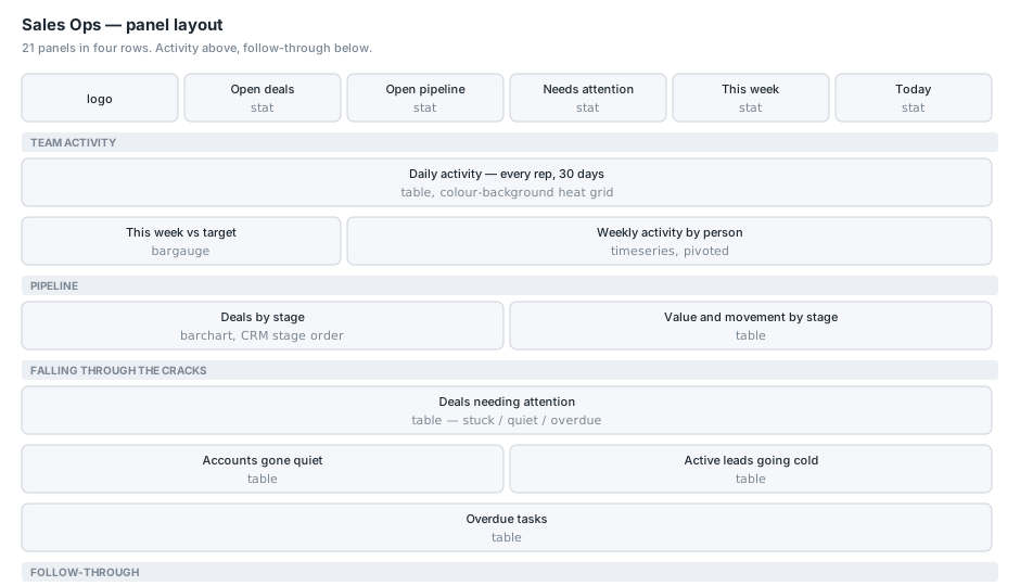
Twenty-one panels, four rows, refreshing every thirty minutes. This article covers the headline strip, the team activity row and the pipeline row. The next one covers what is falling through the cracks and whether anybody is following through.
All names in the screenshots and examples are anonymised, and the activity numbers are real.
The headline strip
Five stat panels, four columns each, sitting beside the logo. Each is a one-line query over a saved function, which is the whole point of having the functions.
HubSpotDealsLatest | where IsOpen | summarize Value = count()
HubSpotDealsLatest | where IsOpen | summarize Value = sum(Amount)
HubSpotDealsLatest | where IsOpen and NeedsAttention | summarize Value = count()
HubSpotActivityLatest | where IsCurrentWeek | summarize Value = count()
HubSpotActivityLatest | where IsToday | summarize Value = count()
Open deals, open pipeline value, deals needing attention, activity this week, activity today.
Only the third has thresholds, at one amber and five red, because it is the only one where a number has a direction. Pipeline value is not good or bad, it just is.
“Open pipeline” sums Amount, and deals with no amount count as zero rather than being excluded. That is a choice and it is worth stating on the panel: the deal count and the value are over the same population, so somebody comparing them is not comparing two different sets.
IsCurrentWeek and IsToday come from the function, not from the panel, so “this week” means Monday to Sunday in local time everywhere on the board.
The daily activity grid
This is the panel people look at, and it went through three designs.
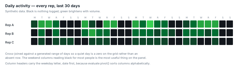
One cell per rep per day, thirty days across, black for nothing and progressively brighter green with volume. The idea is that you can compare people against each other on the same day at a glance, and that a rep who works Monday to Friday and stops has a visibly different pattern from one who does not.
It is a table rather than a heatmap panel, and each column header carries the weekday letter.
let tz = "America/New_York";
let today = startofday(datetime_utc_to_local(now(), tz));
let start = today - 29d;
let people = HubSpotActivityLatest
  | where LocalCreated >= start and OwnerName != "(unassigned)"
  | distinct OwnerName;
let days = range Day from start to today step 1d
| extend DW = case(dayofweek(Day) == 0d, "S", dayofweek(Day) == 1d, "M",
                   dayofweek(Day) == 2d, "T", dayofweek(Day) == 3d, "W",
                   dayofweek(Day) == 4d, "R", dayofweek(Day) == 5d, "F", "S")
| extend Label = strcat(format_datetime(Day, "MM-dd"), " ", DW);
days
| extend k = 1
| join kind=inner (people | extend k = 1) on k
| project Day, Label, OwnerName
| join kind=leftouter (
    HubSpotActivityLatest
    | where LocalCreated >= start and OwnerName != "(unassigned)"
    | summarize C = count() by Day = startofday(LocalCreated), OwnerName
  ) on Day, OwnerName
| extend C = coalesce(C, 0)
| project Rep = OwnerName, Label, C
| evaluate pivot(Label, sum(C), Rep)
Four things in there are load-bearing.
The cross join. range produces every day in the window, and the inner join against the distinct list of people produces every rep-day combination. Only then does the left join bring in actual counts, with coalesce(C, 0) filling the gaps. Without this a day nobody worked has no row at all, and an absent cell renders as “no data” rather than as black. On a grid whose entire purpose is to show you the gaps, that is the difference between working and not.
R is Thursday. M, T, W, R, F, S, S. Using T for both Tuesday and Thursday, or S for both weekend days, makes the header ambiguous exactly where you are trying to read a pattern.
The date leads the label. This one I got wrong first and had to test. evaluate pivot() orders its columns alphabetically, not by input order. A header of "F 08-28" files every Friday next to every other Friday and scrambles the calendar. Putting the date first, "08-28 F", sorts chronologically. I confirmed that by running a pivot over a synthetic range and looking at the column order, which took two minutes and would have taken a lot longer to spot on the rendered board.
Colour lives in the field defaults, not in overrides. The columns are generated by the query, so their names change every day. Any override list naming them would rot within twenty-four hours. The defaults carry the thresholds, and one override targets the Rep column to make it wider, left-aligned and uncoloured.
The thresholds are a five-step scale: black at zero, then progressively brighter greens at 1, 3, 8 and 16. The weekend columns being black for most people is not a rendering bug, it is the most useful thing on the panel.
This week against target
A bargauge, one bar per person, showing activity logged since Monday against a target.
HubSpotActivityLatest
| where IsCurrentWeek and OwnerName != "(unassigned)"
| summarize Activities = count() by Person = OwnerName
| order by Activities desc
| evaluate pivot(Person, sum(Activities))
The target is a Terraform variable in the dashboard layer rather than the collector layer, because nothing about a target reaches the collector and presentation belongs beside the thing it colours:
variable "sales_activity_targets" {
  type = object({
    weekly = number
    daily  = number
  })
}
It is interpolated into the panel’s thresholds along with two derived values, computed in Terraform so three numbers that must stay in step are calculated once rather than typed three times:
weekly_activity_target      = var.sales_activity_targets.weekly
weekly_activity_target_half = floor(var.sales_activity_targets.weekly / 2)
weekly_activity_target_max  = ceil(var.sales_activity_targets.weekly * 1.5)
One escaping detail. These render as bare numbers in the JSON, not strings, so the placeholder must be unquoted in the template:
"max": ${weekly_activity_target_max},
"thresholds": {
  "steps": [
    { "color": "red",      "value": null },
    { "color": "#EAB839",  "value": ${weekly_activity_target_half} },
    { "color": "green",    "value": ${weekly_activity_target} }
  ]
}
Leaving the quotes on gives Grafana a string where it expects a number, and the panel renders with no colouring and no error.
Weekly activity by person
A twelve-week line chart, one line per person plus a team total, with the target as a dashed line.
This panel started as a table, a row per person per week. It was accurate and you could not see a trend in it, which is what a table is bad at.
let tz = "America/New_York";
let thisWeek = startofweek(datetime_utc_to_local(now(), tz) - 1d) + 1d;
let start = thisWeek - 77d;
let people = HubSpotActivityLatest
  | where WeekStart >= start and OwnerName != "(unassigned)"
  | distinct OwnerName;
let weeks = range WeekStart from start to thisWeek step 7d;
let perPerson = weeks
  | extend k = 1
  | join kind=inner (people | extend k = 1) on k
  | project WeekStart, OwnerName
  | join kind=leftouter (
      HubSpotActivityLatest
      | where WeekStart >= start and OwnerName != "(unassigned)"
      | summarize T = count() by WeekStart, OwnerName
    ) on WeekStart, OwnerName
  | extend Activities = coalesce(T, 0)
  | project WeekStart, OwnerName, Activities;
perPerson
| union (perPerson
         | summarize Activities = sum(Activities) by WeekStart
         | extend OwnerName = "TOTAL (all reps)")
| evaluate pivot(OwnerName, sum(Activities), WeekStart)
| order by WeekStart asc
Same cross-join-and-zero-fill as the grid, for the same reason: a quiet week should drop the line to the axis, not skip the point and draw a straight segment over the top of it.
The pivot is the fix for a bug I shipped. The first version returned long format: a time column, a person column and a count column. The chart rendered with no names on it at all, one line called “Activities”. Grafana names the series after the numeric column when there is more than one string column in play, so all three people were being merged into one series. Pivoting so each person becomes a column means the series take their names from the column headers. I hit the identical bug on a different dashboard a week later, which is why I now reach for the pivot by default on any multi-series time chart.
The team total rides the same axis rather than a second one. It sits just above the busiest individual, so it costs almost no vertical range, and a second axis would invite reading the two scales as if they were one. An override gives it a neutral grey and a heavier line so it reads as an aggregate rather than a person.
One small thing that cost twenty minutes: the total series was originally named with an em dash. That name travels through JSON escaping into a KQL string literal, and it survived one layer but not the next, producing a series called TOTAL — all reps on the board. It is ASCII now.
Deals by stage
The pipeline row opens with a horizontal bar chart.
HubSpotDealsLatest
| where IsOpen
| summarize Deals = count() by Stage, StageOrder
| order by StageOrder asc
| project Stage, Deals
StageOrder comes from the CRM’s own displayOrder, resolved at collection time. Sorting on it and then projecting it away gives a funnel in workflow order without the dashboard knowing anything about what the stages are. Adding a stage in HubSpot needs no change here.
Closed Won and Closed Lost are excluded by IsOpen. This panel answers what is still in play.
Value and movement by stage
The table beside it, and the column I care most about is the last-but-one.
HubSpotDealsLatest
| where IsOpen
| summarize Deals = count(),
            Value = sum(Amount),
            Weighted = sum(Amount * Probability),
            ['Median days in stage'] = percentile(DaysInStage, 50),
            Stuck = countif(IsStuck)
        by Stage, StageOrder
| order by StageOrder asc
| project Stage, Deals, Value, Weighted, ['Median days in stage'], Stuck
Weighted multiplies by the stage’s own win probability from the CRM. That is not a forecast, it is arithmetic on a number somebody configured, and I would not present it as more than that.
Median days in stage is the bottleneck detector. A stage where everything sits for weeks is a problem regardless of how much money is parked in it, and it is invisible on the bar chart above. Median rather than mean, because one ancient deal drags a mean badly.
Stuck counts deals past the stuck threshold within each stage, so you can see whether a slow stage is slow for everything or slow because of a few.
The numeric columns get colour-background overrides with gradients: days in stage amber at 14 and red at 30, stuck amber at 1 and red at 3. Value and weighted get currencyUSD and fixed widths.
Conclusion
The pattern across all of these panels is the same: the saved function did the thinking, and the panel is a filter and a summarize. That is what lets a dashboard grow to twenty-one panels without becoming twenty-one slightly different opinions about what a stale deal is.
The two things I would take away are both about presentation rather than data. Cross-join and zero-fill anything where an absence is meaningful, because Grafana renders a missing row and a zero completely differently and only one of them is what you meant. And pivot your multi-series time charts, because long format quietly merges your series and names the result after the wrong column. Neither of those is discoverable from looking at the chart, which is exactly why they are worth knowing in advance. The next article covers the two rows that turned out to be the reason anybody opens this dashboard.