The FinOps Dashboard, Panel by Panel
Three articles ago I started on Azure cost data, and the last two covered the collector and the saved function that deduplicates it. This article is the dashboard, which is the shortest of the four because by this point almost nothing is left to do.
That is the payoff of the design rather than a coincidence. Every panel here is one or two lines of KQL over AzureCostLatest(). If these panels were querying the raw table, each one would carry six lines of deduplication before it got to the interesting part, and one of them would eventually be missing it.
Nine panels, refreshing every thirty minutes over a thirty day window.
The layout
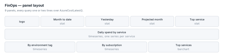
A row of four headline numbers, one wide chart across the full width, and three narrower charts underneath. It reads top to bottom as: what are we spending, how has that moved, and where is it going.
The headline numbers
Four stat panels, five columns wide each, sitting beside the logo.
Month to date
AzureCostLatest()
| where CostDate >= startofmonth(now())
| summarize Value = round(sum(Cost), 2)
Unit currencyUSD, two decimals, no thresholds. There is no good or bad value for month-to-date spend, only a number, and colouring it would imply a target we do not have.
Note the filter is on CostDate rather than TimeGenerated. Month to date means money spent this month, not rows ingested this month. Those are different sets, because a restatement of last month’s spend arrives this month.
Yesterday
AzureCostLatest()
| where CostDate == startofday(now() - 1d)
| summarize Value = round(sum(Cost), 2)
Yesterday rather than today, because today is incomplete and a partial day next to a full one invites a comparison that is always wrong. Cost data also lags between eight and twenty-four hours, so today’s number would be missing most of itself even if you wanted it.
Projected month
This is the only panel with any real arithmetic in it:
let mtd = toscalar(AzureCostLatest()
  | where CostDate >= startofmonth(now())
  | summarize sum(Cost));
let elapsed = todouble(datetime_diff('day', startofday(now()), startofmonth(now())));
let inmonth = todouble(datetime_diff('day',
  startofmonth(datetime_add('month', 1, now())), startofmonth(now())));
print Value = round(iff(elapsed <= 0.0, 0.0, mtd / elapsed * inmonth), 0)
Month to date, divided by days elapsed, times days in the month. A straight-line projection, which is the least clever forecast available and the only one I trust on infrastructure spend that is mostly fixed-rate compute.
Two details. inmonth is derived by taking the start of next month and differencing, rather than hardcoding a number of days, so February and the thirty-one day months work without special cases. And the iff(elapsed <= 0.0, ...) guard handles the first of the month, when elapsed is zero and the division would produce a null that renders as “No data” on the panel.
This panel is allowed a let because it is a panel query rather than a saved function. The restriction from the previous article applies only to saved search bodies.
Yesterday’s top service
AzureCostLatest()
| where CostDate == startofday(now() - 1d)
| summarize Cost = sum(Cost) by ServiceName
| top 1 by Cost desc
| project ServiceName, Cost
The stat panel renders the service name as the label and the figure as the value, so you get “Azure Kubernetes Service · $84.10” in one tile. It answers “what is the biggest line item right now” without making you read the chart below.
Daily spend by service
The main chart, full width, ten rows tall.
AzureCostLatest()
| summarize Cost = round(sum(Cost), 4) by CostDate, ServiceName
| order by CostDate asc
Long format: a time column, a value column and a series column. Grafana’s Azure Monitor data source splits this into one series per ServiceName and names them accordingly. This is the pattern I referenced in the Platform Operations article, and it is the shape I later got wrong on a different dashboard and had to come back and fix, so it is worth being precise about why it works here.
It works because ServiceName is the only string column left after the summarize. When there is exactly one string column and one numeric column, the data source uses the string as the series name. Add a second string column and the behaviour changes, and you get one series named after the numeric column instead. That is the bug I shipped later, on a chart that was supposed to have one line per person and ended up with a single line called “Throughput”.
Four decimal places on the rounding rather than two, because these are per-service-per-day numbers and several of our services cost fractions of a cent per day. Rounding to two would floor a lot of small series to zero and make the legend full of flat lines at the axis. The panel display unit still formats as currency.
No where clause on the time range. The dashboard’s own picker constrains it, which is what you want on a chart people zoom.
Daily spend by environment
AzureCostLatest()
| summarize Cost = round(sum(Cost), 4) by CostDate, Environment
| order by CostDate asc
Identical shape, grouped on the tag instead. This is the panel that exists because somebody asks “how much of this is dev” roughly once a month.
Environment here is already normalised by the saved function, which is where the (untagged) bucket comes from. As I covered in the previous article, that normalisation happens before the deduplication for a specific reason: rows written by an older, buggier version of the collector carry a different label for the same thing, and normalising afterwards would leave them as separate groups and double count every untagged dollar.
The untagged series is usually the third largest on this chart, which is itself a useful piece of information and an argument for bucketing rather than dropping.
Daily spend by subscription
AzureCostLatest()
| summarize Cost = round(sum(Cost), 4) by CostDate, SubscriptionName
| order by CostDate asc
Same again, grouped by subscription. This is the one that pays for itself. We run per-developer sandbox subscriptions, and before this chart existed nobody had a cheap way to notice that one of them had been left with something expensive running. It shows up here as a line that does not go back down.
SubscriptionName rather than SubscriptionId, because the collector resolves the name at read time:
SUB_NAME=$(az account show --subscription "$SUB" --query name -o tsv 2>/dev/null || echo "$SUB")
The fallback to the raw GUID matters. If the identity loses read access to a subscription, you get a chart series labelled with a GUID rather than a chart that fails, and a GUID in the legend is a legible signal that something is wrong with permissions.
Top services for the window
AzureCostLatest()
| summarize Cost = round(sum(Cost), 2) by ServiceName
| top 12 by Cost desc
| order by Cost desc
A horizontal bar chart, no legend, twelve bars. The time series above answers “how is this moving”; this answers “what is it, ranked” for whatever window the picker is on.
Twelve is an arbitrary number chosen so the bars stay readable at the panel height. top then order looks redundant but is not: top selects, and the subsequent order controls the direction the bars are drawn in.
Two decimals here rather than four, because these are window totals rather than per-day figures and nothing rounds to zero.
What I left off
Two things I considered and did not build, for reasons that might be useful.
A budget or target line. Grafana will happily draw a threshold across a time series, and I could put our monthly budget on the daily spend chart. I did not, because a daily figure against a monthly budget needs dividing by something and the something changes with the length of the month. The projection tile answers the same question honestly.
Anomaly detection. KQL has series_decompose_anomalies and it is genuinely good. It also needs a reasonably long, reasonably stable history to be useful, and our spend has been growing and changing shape as we build. I would rather add it when the baseline means something than have it cry wolf every time we deploy a new service.
Reproducing this
The whole dashboard is one JSON file in the Terraform layer, picked up by a fileset() walk. Adding it was dropping a file into dashboards/FinOps/.
The only templated values in it are the data source UID and the workspace resource ID, injected by templatefile():
"datasource": { "type": "grafana-azure-monitor-datasource", "uid": "${shared_datasource_uid}" },
"azureLogAnalytics": {
  "resources": ["${shared_workspace_id}"],
  "resultFormat": "table",
  "dashboardTime": false,
  "query": "AzureCostLatest() | ..."
}
dashboardTime: false on every target is deliberate. It means the panel query is not automatically wrapped in the dashboard’s time filter, so the queries control their own windows. Month to date means month to date regardless of what the picker says. The charts that should follow the picker do so because they have no explicit time filter and Grafana applies the range to the time column.
Getting that backwards produces a “month to date” tile that changes when somebody drags the time picker, which is the sort of thing that erodes trust in a dashboard quickly.
Conclusion
Nine panels and not one of them is more than five lines of KQL, because the collector normalised the shape and the saved function resolved the duplicates. That is the whole argument for the layering, and it is much easier to see here at the end than it was at the start.
If I were doing it again I would change one thing: I would compare a settled month against the actual invoice on the day I built it, rather than a few weeks later. The deduplication key is the one thing in this design that is quietly load-bearing, and the only real test of it is whether the total matches the bill. It did, but I would rather have known that on day one than assumed it for a fortnight. The next article starts on HubSpot, where the data is messier, the API has more objects than you expect, and the thing that nearly went wrong was a definition of “week”.