Platform Operations, Panel by Panel
The previous article covered the techniques behind our Platform Operations dashboard: labelling environments from _ResourceId, seeding results so absent things still render, collapsing API and worker pods into one light, and pushing domain gauges through AppEvents. This article is the dashboard itself, panel by panel, with the query behind each one.
It is sixteen panels on a 24-column Grafana grid, refreshing every minute over a six hour window, and it lives on a wall-mounted screen in the office. I am going to go through it in the order you read it, from the top strip down, and for each panel say what it answers, what produces it, and where relevant what I got wrong first.
The layout
The board is four bands. A strip of four headline numbers across the top, two rows of service health lights directly under it, four time series charts across the middle, and three summary tables at the bottom. The health lights sit second rather than first deliberately: the headline numbers tell you whether anything is wrong, and the lights tell you where, so they belong adjacent.
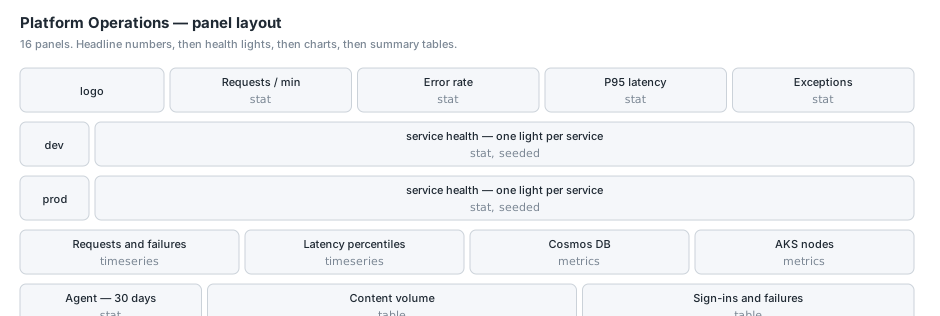
Band 1: the headline numbers
Four stat panels, each five columns wide, each showing one number per environment side by side. All four read AppRequests or AppExceptions and all four use the dashboard time range through $__timeFilter, so changing the picker changes all of them together.
Requests per minute
AppRequests
| where $__timeFilter(TimeGenerated)
| extend env = iff(_ResourceId has "prod", "prod", "dev")
| summarize Value = round(count() / 5.0, 1) by env
The / 5.0 is not a magic number I would defend hard. It converts the count over the window into an approximate per-minute rate for the five minute default the panel was built against. If you change the dashboard’s default range you should change this or switch to a proper bin() and average. I have left it because the panel is a glance rather than a measurement, and the chart underneath it is the real answer.
No thresholds. Request rate has no good or bad value, it just is, and colouring it would imply otherwise.
Error rate
AppRequests
| where $__timeFilter(TimeGenerated)
| extend env = iff(_ResourceId has "prod", "prod", "dev")
| summarize Value = iff(count() == 0, 0.0,
    round(100.0 * countif(Success == false) / count(), 2)) by env
Thresholds at 1% amber and 5% red, unit percent, two decimals.
The iff(count() == 0, ...) guard exists because a division by zero in KQL produces a null rather than an error, and a null in a stat panel renders as “No data”, which on a wall display reads as “the dashboard is broken” rather than “nothing happened in the last five minutes”. Our dev environment is quiet at night. Returning an explicit zero is the difference between a calm dashboard and a panicked message on a Sunday.
P95 latency
AppRequests
| where $__timeFilter(TimeGenerated)
| extend env = iff(_ResourceId has "prod", "prod", "dev")
| summarize Value = round(percentile(DurationMs, 95), 0) by env
Milliseconds, thresholds at one second amber and three seconds red. P95 rather than average, for the usual reason that an average latency is dominated by the fast requests and tells you nothing about the experience anybody is complaining about.
Exceptions
AppExceptions
| where $__timeFilter(TimeGenerated)
| extend env = iff(_ResourceId has "prod", "prod", "dev")
| summarize Value = count() by env
Thresholds at 500 amber and 5000 red, which are high numbers because this is a raw count over the window rather than a rate, and because a handful of exceptions is normal in any system with retries.
Band 2: the service health lights
Two stat panels, each 22 columns wide and only 2 rows tall, one for each environment, with a small text panel to the left of each acting as a row label. This is the panel people actually look at.
Each one renders one light per service. The thresholds are 0 red, 1 amber, 2 green, 3 grey, and the values come out of the union I described in the previous article:
let seed = datatable(Series:string, Value:long, Ord:long)
  ["dotcom", 3, 0, "frontend", 3, 0, "claims", 3, 1, "risk", 3, 1];
let sites = AppAvailabilityResults
  | where TimeGenerated > ago(30m)
  | extend e = iff(_ResourceId has "prod", "prod", "dev")
  | where e == "dev"
  | extend site = tostring(split(Name, "-")[2])
  | summarize ok = countif(Success == true), total = count() by site
  | project Series = site,
            Value = tolong(case(ok == 0, 0, ok < total, 1, 2)),
            Ord = tolong(0);
let services = KubePodInventory
  | where TimeGenerated > ago(15m)
  | where Namespace == "my-namespace"
  | extend env = iff(_ResourceId has "prod", "prod", "dev")
  | extend svc = extract(@"^(.*?)-[0-9a-f]{8,}-", 1, Name)
  | where isnotempty(svc)
  | extend svc = replace_regex(svc, @"-worker$", "")
  | summarize arg_max(TimeGenerated, PodStatus) by env, svc, Name
  | summarize ready = countif(PodStatus == "Running"), total = count() by env, svc
  | extend state = tolong(case(ready == 0, 0, ready < total, 1, 2))
  | summarize Value = anyif(state, env == "dev") by svc
  | project Series = svc, Value, Ord = tolong(1);
union seed, sites, services
| summarize Value = min(Value) by Series, Ord
| order by Ord asc, Series asc
| project Series, Value
Three things in there are worth pointing at.
The two environments have their own panel rather than sharing one, and each filters to its own environment near the end. That is why the query looks duplicated. I tried a single panel with both environments as separate series and it was unreadable, because Grafana’s stat panel lays tiles out by aspect ratio and forty tiles in one panel wrapped unpredictably as the browser resized. Two panels of twenty each hold their shape.
The window differs between the two sources. Availability tests look back thirty minutes because they run every few minutes and you want more than one sample. Pod inventory looks back fifteen, because it is sampled more often and a longer window means a pod that has since recovered still drags its service to amber.
anyif(state, env == "dev") rather than a where earlier is a small thing that took me a while. The inner summarize groups by env and svc so both environments are present at that point, and filtering earlier would have meant two nearly identical let blocks. Picking the environment at the end keeps one block.
The order is Ord then Series, which puts the two static sites first and then every Kubernetes service alphabetically. Because both panels use the same ordering, a service sits directly above its twin in the other environment, and you can compare down a column rather than hunting.
Band 3: the time series
Four timeseries panels, six columns each, filling one row. Two read logs, two read metrics, and the difference matters.
Requests and failures
Four targets on one panel: requests for dev, requests for prod, failures for dev, failures for prod. Each is its own query:
AppRequests
| where $__timeFilter(TimeGenerated)
| extend env = iff(_ResourceId has "prod", "prod", "dev")
| where env == "dev"
| summarize ["requests-dev"] = count() by bin(TimeGenerated, 1m)
| order by TimeGenerated asc
The series name is baked into the summarize as a column alias, which is how these panels get stable names. Field overrides then match on ^requests-dev$ and friends to colour them, with failures in red and prod in a heavier weight than dev.
I want to flag the column-alias trick because it comes up again later in this series and it is the fix for a bug I shipped more than once. When a query returns a time column, a value column and a string column, Grafana names the series after the value column, not after the string column. So a query that summarises by bin(TimeGenerated, 1m), env produces one series called “count_” rather than two called “dev” and “prod”. Either alias the column per query, as here, or pivot so each series is its own column. Both work. Neither is discoverable from the chart, because a single unnamed series looks like a chart with one line rather than a chart that has silently merged your data.
Latency percentiles
Same shape, two targets, p95-dev and p95-prod, unit milliseconds.
AppRequests
| where $__timeFilter(TimeGenerated)
| extend env = iff(_ResourceId has "prod", "prod", "dev")
| where env == "dev"
| summarize ["p95-dev"] = round(percentile(DurationMs, 95), 0) by bin(TimeGenerated, 1m)
| order by TimeGenerated asc
Cosmos DB requests and throttling, and AKS node CPU and memory
These two are Azure Monitor metric targets rather than log queries, and they are the exception to everything I said about spanning environments in one query. A metric target names a specific resource, so it cannot cross a subscription boundary.
The panel carries four targets: request count and throttled count for the dev account, and the same two for prod. The environments are separated at the panel level rather than inside a query. Series naming is by target alias, and overrides colour throttling red.
The AKS panel is the same pattern with node CPU and memory percentage, thresholds at 75 and 90.
If you are building something similar, the rule I would give is: logs can span subscriptions, metrics cannot, and if a panel mixes both you will end up with one panel per environment whether you wanted to or not.
Band 4: the summary tables
Content volume
This is a table rather than a set of stat tiles, and the reason is layout. A Grafana stat panel has no column count. It infers its arrangement from the panel’s aspect ratio, so six values kept collapsing onto one line at certain widths and wrapping at others. A table’s shape comes from the data, so two rows of three columns hold at any width. That is a boring reason to choose a panel type and it is the correct one.
let seed = datatable(Env:string, Metric:string, Val:long)
  ["DEV","contracts",0,"DEV","pages",0,"DEV","policies",0,
   "PROD","contracts",0,"PROD","pages",0,"PROD","policies",0];
let base = AppEvents
  | where $__timeFilter(TimeGenerated)
  | extend Env = iff(_ResourceId has "prod", "PROD", "DEV");
let contracts = base
  | where Name == "ContractInventory"
  | extend K = tostring(Properties.TenantId), E = tostring(Properties.Entity),
           V = toint(Properties.Count)
  | where E in ("BaseAgreement", "Amendment")
  | summarize arg_max(TimeGenerated, V) by Env, K, E
  | summarize Metric = "contracts", Val = sum(V) by Env;
...
union seed, contracts, pages, policies
| summarize ['# of Contracts'] = sumif(Val, Metric == "contracts"),
            ['# of Pages']     = sumif(Val, Metric == "pages"),
            ['# of Policies']  = sumif(Val, Metric == "policies")
        by Env
| order by Env asc
The arg_max before the sum is the gauge handling from the previous article: latest reading per key, then total across keys.
Both environment rows are seeded, so a quiet environment shows zeros rather than disappearing. An absent row reads as “there is no such environment”, when the truth is “nothing has been emitted there yet”, and those are very different messages.
Every cell is a link into the content volume deep dive, using the same field-link pattern as the health lights. The summary is where you notice a number looks wrong and the breakdown by tenant is one click away.
One honesty note that lives in the panel description as well as here. The policies column counts policy versions, not distinct policies, because the underlying query sums a version count. Today those two numbers are within about one percent of each other because almost every policy has a single version, so the label has never been visibly wrong. It will drift. I would rather write that down than discover it in a meeting.
Sign-ins and failures
let seed = datatable(Env:string, ae:string, TimeGenerated:datetime)
  ["DEV","seed",datetime(1970-01-01),"PROD","seed",datetime(1970-01-01)];
let events = AppTraces
  | where TimeGenerated > ago(30d)
  | extend ae = tostring(Properties.AccessEvent)
  | where ae in ("UserSignedIn", "UserAuthenticationFailed")
  | extend Env = iff(_ResourceId has "prod", "PROD", "DEV")
  | project Env, ae, TimeGenerated;
union seed, events
| summarize ['SUCCESS < 24h'] = countif(ae == "UserSignedIn" and TimeGenerated > ago(24h)),
            ['SUCCESS < 30d'] = countif(ae == "UserSignedIn"),
            ['FAILURE < 24h'] = countif(ae == "UserAuthenticationFailed" and TimeGenerated > ago(24h)),
            ['FAILURE < 30d'] = countif(ae == "UserAuthenticationFailed")
        by Env
| order by Env asc
Counted rather than arg_max‘d, because a sign-in is an occurrence rather than a gauge. That is also why these live in AppTraces while the content numbers live in AppEvents.
The column headers are the time window alone, and colour carries the meaning: the first two columns are green for successes, the last two red for failures. Grafana’s table has no two-tier header, so a SUCCESS and FAILURE banner spanning pairs of columns is not available. Rather than spend header width repeating the words, the override colours them. The underlying column names keep the full text, which is what the overrides match on.
One definitional note that belongs on the panel and not in somebody’s head: failures here are rejected tokens only. A valid token belonging to a user with no profile, and a real profile with access to nothing, are both real failure modes and neither is counted here. They are charted on the access deep dive instead.
The agent summary
A rolling thirty day stat panel over AppTraces, seeded the same way as everything else so a quiet month reads as zeros:
let seed = datatable(Series:string, Value:long)
  ["Chat sessions", 0, "CRM contacts", 0, "Blocked", 0];
let actual = AppTraces
  | where TimeGenerated > ago(30d)
  | extend evt = tostring(Properties.LeadEvent)
  | where evt in (...)
  | summarize Value = count() by Series;
union seed, actual
| summarize Value = sum(Value) by Series
| extend Ord = case(Series == "Chat sessions", 1, Series == "CRM contacts", 2, 3)
| order by Ord asc
| project Series, Value
Ord again, for the same reason as the health lights: the three numbers have a natural reading order that is not alphabetical, and without it they shuffle.
Conclusion
Sixteen panels, no collector, and the only thing we had to build was the instrumentation for the handful of numbers Azure cannot know about on its own. Most of the work was in the querying, and most of the mistakes were in presentation rather than data: a stat panel that reflowed at certain widths, a series that silently merged because Grafana named it after the wrong column, a light that never appeared because summarize had nothing to emit.
That last one is the theme. Every panel on this board that could legitimately return nothing is unioned with a seed table, because on a dashboard that people trust at a glance, silence and health look identical. If you build one thing from this article, build the seed table habit. The next article moves on to the first real collector, where Azure Cost Management forces you to deal with data that changes after you have already recorded it.